
With the Champions League and Europa League group stages almost upon us, it's time to turn our attention to Europe and, more importantly, the vast array of kits that will be worn by the biggest clubs in the 2020-21 competitions.
After ranking every club in the Premier League by their uniforms for this season we thought it high time to examine the continent's top teams.
There are updates on iconic designs, some unlikely sources of inspiration and a few jerseys that will leave you scratching your head, wondering how they ever got made.
We have compiled them here and ranked each club by their collective output from worst to best. Everyone will have their own opinion, and this ranking is no different.
- Ogden: Messi vs. Ronaldo highlights Champions League draw
- Awful warm-up kits: Barca, Juve, City among worst offenders
- ESPN+ viewer's guide: Bundesliga, Serie A, MLS, FA Cup and more
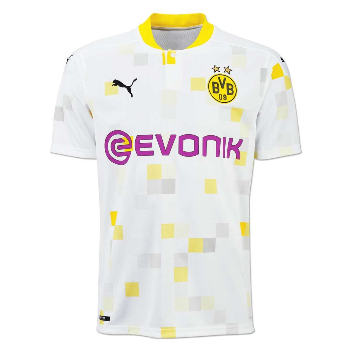
11. Borussia Dortmund (Puma)

You've simply got to hand it to Puma -- they have set out to make an impact with Dortmund's kits this season. We're just not sure it's the impact they wanted.
According to the manufacturer, the home shirt is inspired by Westfalenhallen station, which is close to the Dortmund stadium. It may be the exact same colours as last season's home shirt, but the jagged black streaks across the "cyber yellow" background are not easy on the eye.
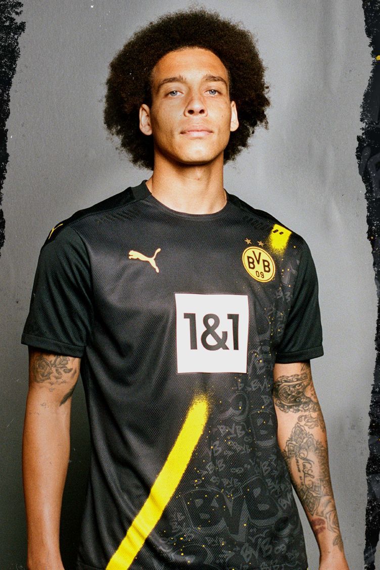
Meanwhile, the accompanying away kit was close to being a reserved "sashed" jersey... until the designers festooned the bottom half of it in a graffiti font that looks suspiciously like Comic Sans.

Dortmund have taken the unusual step of also releasing dedicated home and away kits to be worn in cup competitions. The yellow home shirt is actually rather smart, with the abstract, blocky graphic print inspired by the famous cubic "U Tower" building in Dortmund.
However the alternate away version falls some way short, looking more like a cycling jersey than a football kit.
- Order Borussia Dortmund's 2020-21 kits via the club's official website
10. Juventus (Adidas)

We welcome the return of Juve's emblematic stripes after last season's controversial half-and-half design. However, while the hand-painted effect is interesting, it gives this jersey an unfinished look.
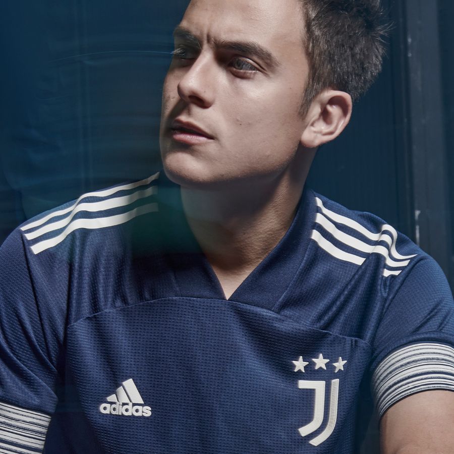
The modern art motif continues in the away jersey with the brush-stroke graphic on the thick sleeve cuffs. The dusky midnight indigo is a nice colour, especially once paired with the silvery moonlight trim, but overall the jersey is quite plain.
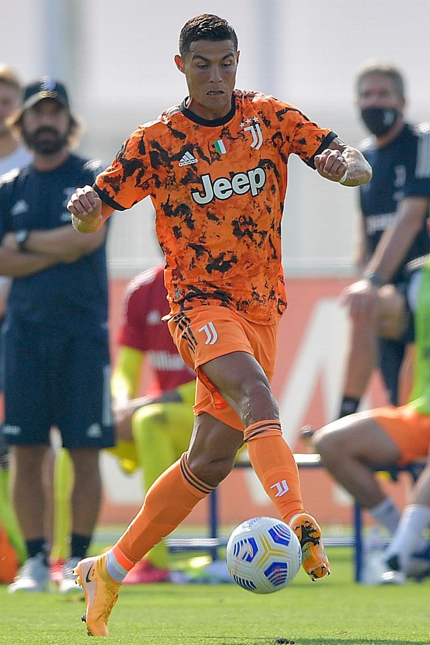
Completing Juve's modern art collection, the third shirt is a design described by Adidas as a "bold" orange. As with many third kits this season, it's one for the street rather than then pitch.
It is sure to polarise opinion, too -- the haters will say it looks like a construction vest, but others will relish making an impact when they step out wearing it.
- Order Juventus' 2020-21 kits via the club's official website
9. Inter Milan (Nike)
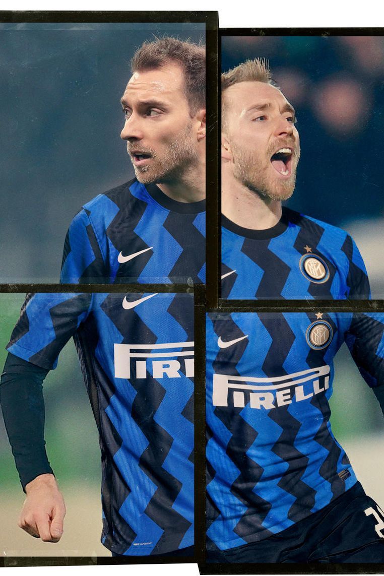
It's difficult to get Inter's glorious Nerazzurri stripes wrong but the zig-zag shirt -- taking its cue from Milanese art movements of the 1980s, according to Nike -- comes perilously close.
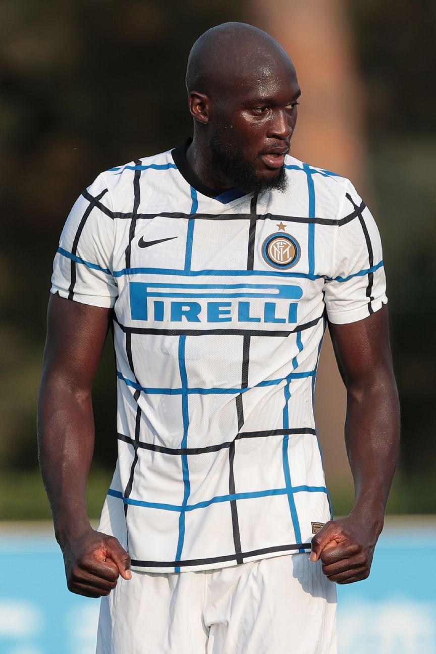
The "grid graphic" in traditional club colours on Inter's new away kit is meant to represent Milan's post-modernist architecture of the same period, Nike says. What it actually represents is a kit that's best forgotten once this season is over.

Making a strong play for the nostalgia crowd, Inter have channeled their much-loved grey-and-black away kit of the mid-1990s and conjuring images of Ronaldo bamboozling defences. It's one of a series of Nike third kits this season to be based on Air Max sneakers from the same era.
- Order Inter Milan's 2020-21 kits via the club's official website
8. Bayern Munich (Adidas)
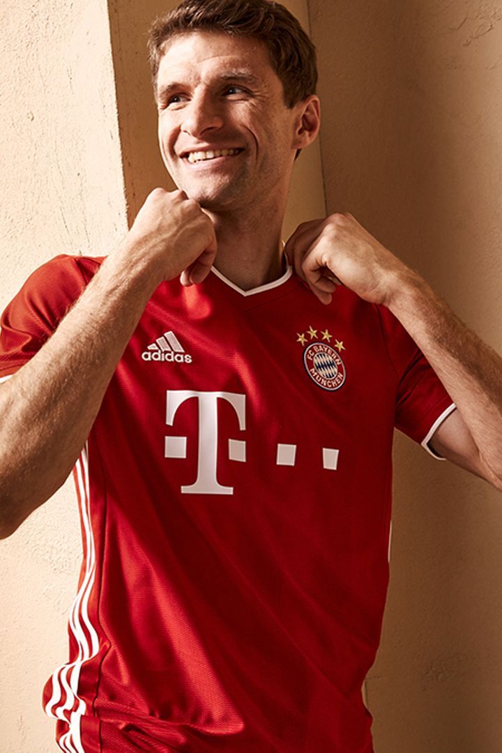
Bayern seem content to follow their spectacular Treble-winning season with plain kits.
The home shirt is a run-of-the-mill red with slivers of white trim, with some very subtle striping embedded in the design. Not very befitting of the champions of Europe.
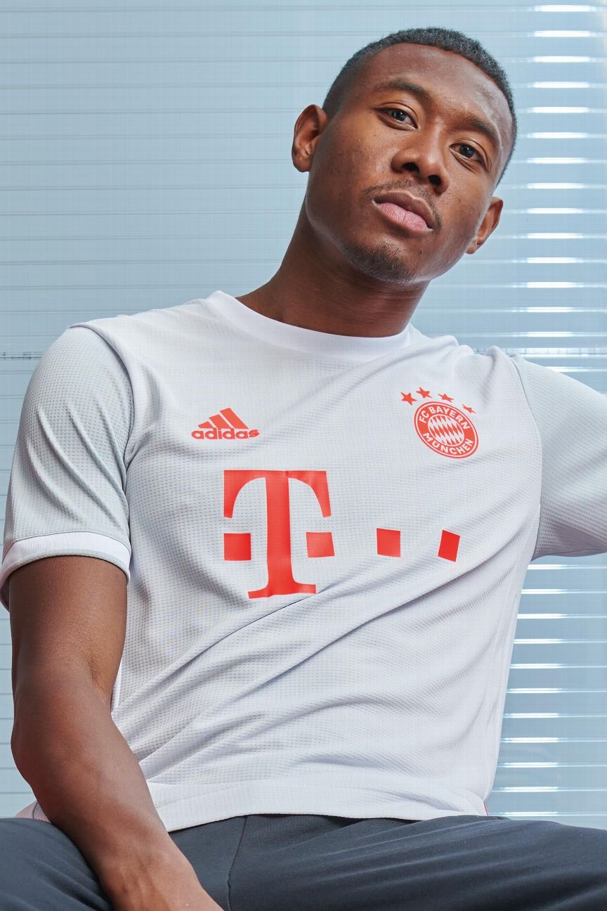
There's nothing really wrong with the away shirt, either. Pale grey and dusty orange, it's a throwback to the away kit worn by Bayern during their 2012-13 Treble-winning campaign, so we'll give them a pass here.
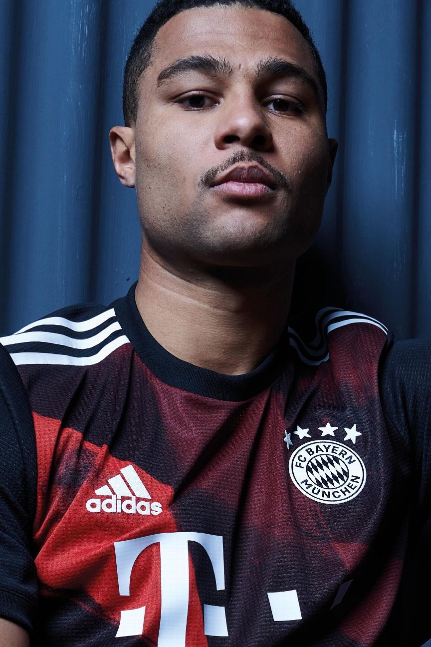
Finally, a pattern! The diamond graphic is an enlarged version of the shapes which appear on the club crest, but ultimately it's still hard to look upon with any kind of aesthetic fervour.
- Order Bayern Munich's 2020-21 kits via the club's official website
7. Barcelona (Nike)

After last season's diversion to a checked pattern caused controversy (was that the real reason that Lionel Messi wanted to leave before the start of the season?) and coincided with their first campaign without a trophy in 12 years, it's back to Blaugrana stripes with a yellow trim.
All in all, a restrained return to tradition, and Barca fans can have hope that the "checkerboard hoodoo" has been dispelled.
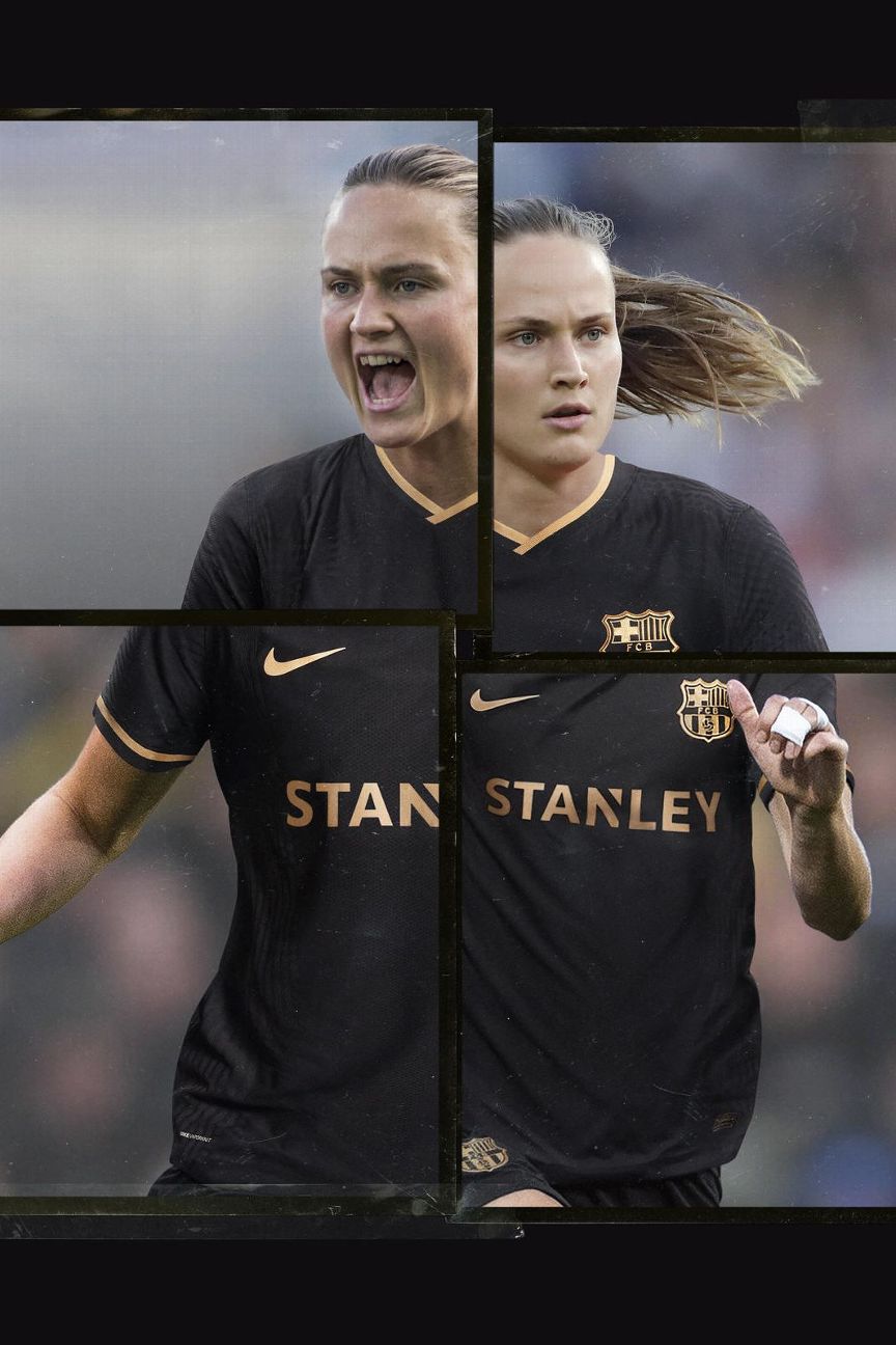
Granted, there's not much to Barca's new shirt in terms of interesting design, but it's a universal fact that black and gold is a reliably regal colour combination.
The eagle-eyed among you will have noticed that the players on Barca's women's team -- such as Caroline Graham Hansen -- have a different shirt sponsor then the men.
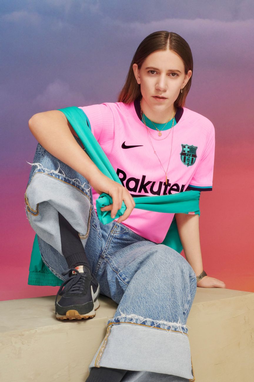
The bright pinks and teals were chosen by Nike's designers to evoke the first breaking light of a Mediterranean dawn. It's more gaudy than Gaudi, but for once Barca have got a neon kit that isn't a complete eye-sore.
- Order Barcelona's 2020-21 kits via the club's official website
6. Paris Saint-Germain (Nike)

PSG celebrated their 50th birthday this year and will stride confidently into middle-age while wearing a shirt emblazoned with their iconic "Hechter stripe" -- named after former club president and fashion designer Daniel Hechter, who first introduced the chunky red band to their shirts in 1973.

A flipped colourway of the home shirt that, while perfectly serviceable, is a little underwhelming. The polo shirt collar is a nice touch, and this design is better complemented by the small tricolore detail on the hem.
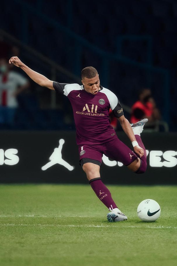
PSG's latest collaboration with Nike's Jordan Brand has resulted in a deliciously rich claret uniform that is based on the classic Air Jordan VII "Bordeaux" sneaker debuted by Chicago Bulls great Jordan at the 1992 NBA All-Star game.
In case that does not jog your memory, Jordan also wore them while appearing alongside another MJ when he starred in the music video for Michael Jackson's 1992 single "Jam."
- Order Paris Saint-Germain's 2020-21 kits via the club's official website
5. Atletico Madrid (Nike)

The finest that Atletico's famous Colchonero red-and-white mattress stripes have looked for many years. Simple but strong with just a touch of elegance -- much like Diego Simeone's team.
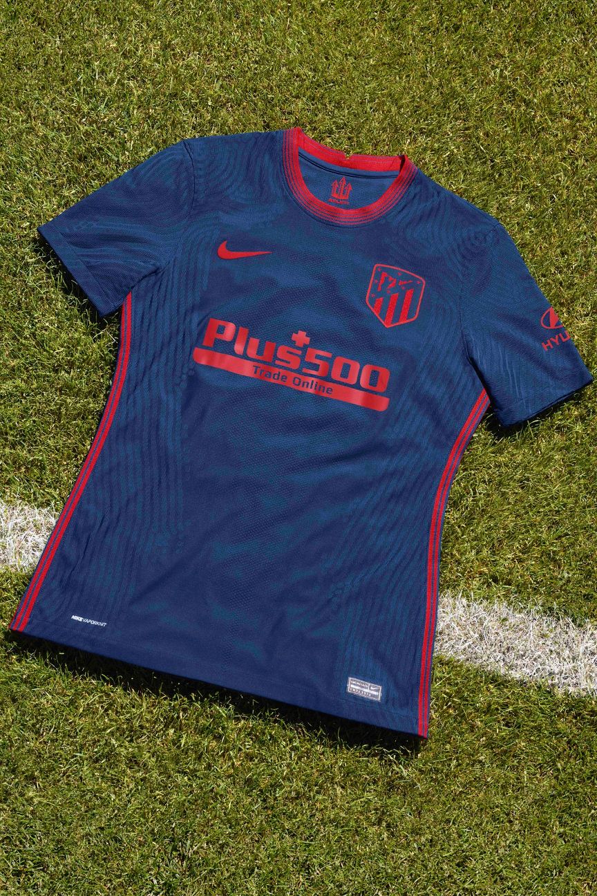
Nike say this is inspired by the Fountain of Neptune in Madrid where Atletico celebrate their victories. In reality, this is just a plain navy shirt with red trim. In fact, it's almost indistinguishable from their 2019-20 away kit.
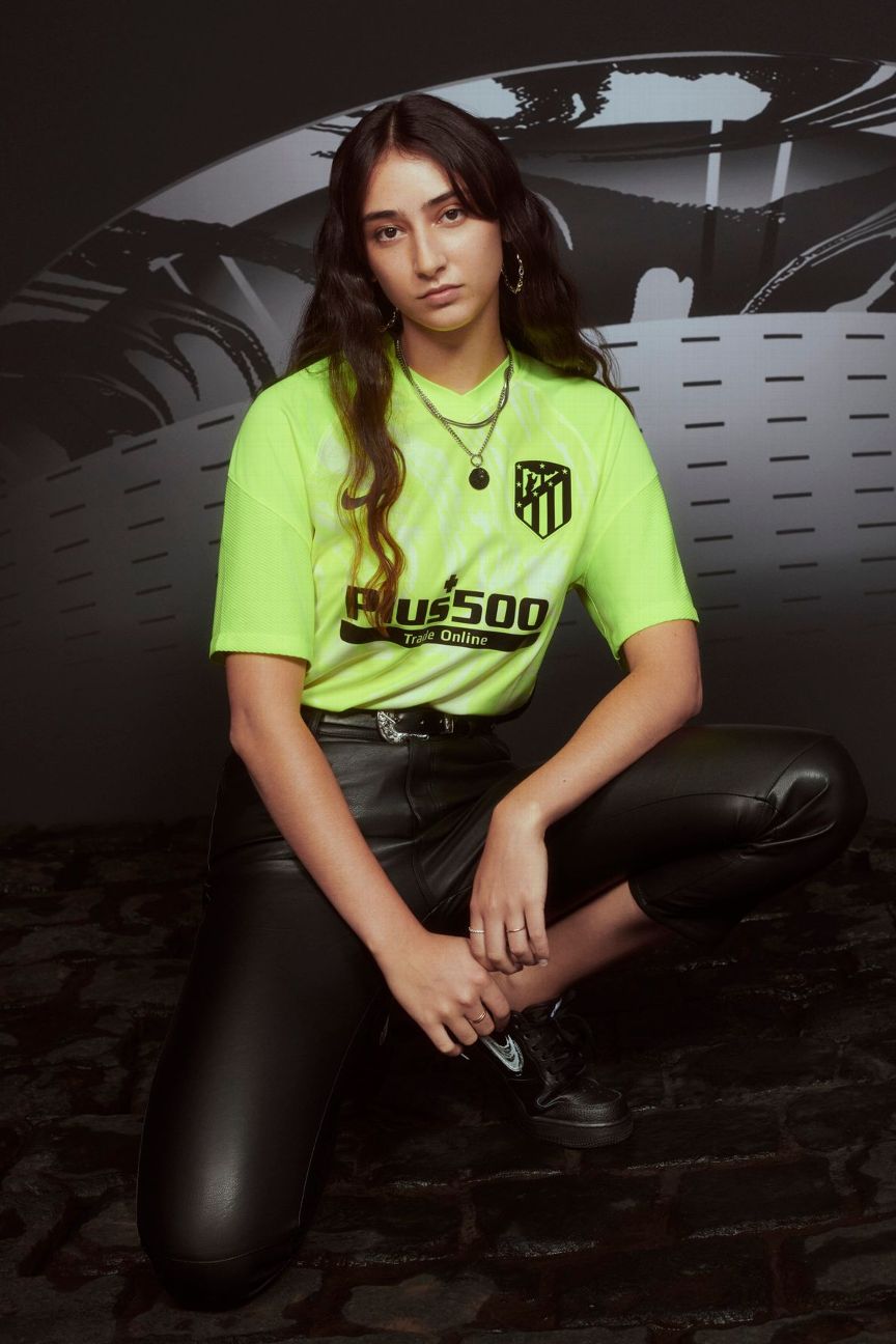
The first thing you'll notice is the fluorescent "volt" colour, but the shirt does also feature a subtle marble graphic all over -- another nod to the Fountain of Neptune. This should look lovely under the floodlights on those chilly Champions League nights.
- Order Atletico Madrid's 2020-21 kits via the club's official website
4. AC Milan (Puma)

Puma designed Milan's new home jersey as an homage to a shopping mall. No, really. Not just any shopping mall, but the Galleria Vittorio Emanuele II -- the oldest and grandest shopping mall in the world. Its domed glass ceiling is echoed subtly in the pattern behind Milan's iconic Rossoneri red-and-black stripes.
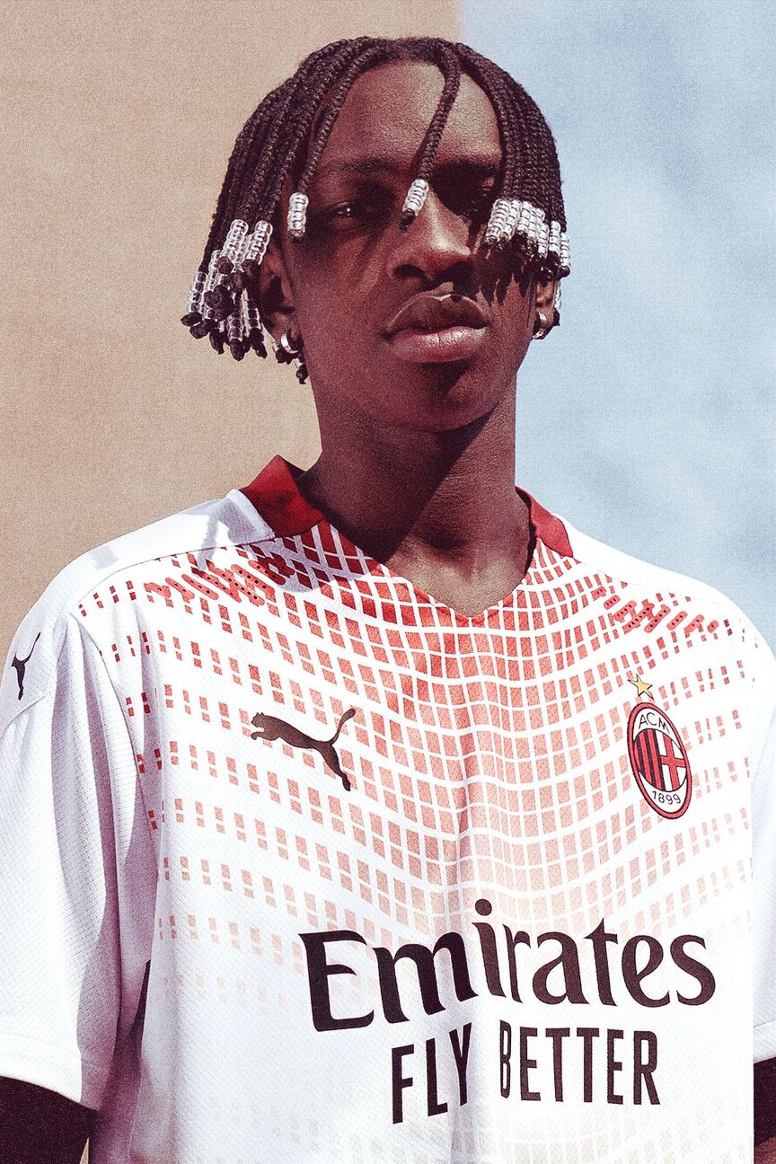
Inspired by more local architecture, Milan's glossy new away shirt features a design that borrows from the curved, segmented windows of the city's MUDEC Museum of Cultures.
It comes with a seal of approval from club legend Franco Baresi, which is good enough for us.

The Rossoneri veer tantalisingly close to the territory of local rivals Inter with a blue third kit, but it's worth it. Puma says that the gradient houndstooth pattern is a nod to the city of Milan's historic connection to the world of high fashion.
- Order AC Milan's 2020-21 kits via the club's official website
3. Ajax (Adidas)

Shedding the unusual black trim that was added last season, Ajax return to a classic red-and-white design with a thick V-neck collar and cuffs.

A lovely, pale ice blue shirt that incorporates a gorgeous glacial graphic specifically drafted in the colours of the Netherlands flag. Cool and classy -- Adidas and Ajax nailed this one.
Europe

A prim but fairly standard black outfit with gold trim, though the understated inversion of their iconic central stripe design is a nice touch.
The shirt will be worn in the Champions League as a celebration of the 50th anniversary of the Dutch club's first European Cup win in 1971 -- the first of a run of three consecutive triumphs in the competition -- hence the gold decoration.
- Order Ajax's 2020-21 kits via the club's official website
2. AS Roma (Nike)

The Giallorossi have delivered again this season with the gradient on the home shirt inspired by the club's cherished "ghiacciolo" ("ice pop") kits, worn from 1978-80.

If anything, the ivory away shirt is even more agreeable having been designed to evoke images of the many statues, fountains and artifacts that fill the historic streets of the Eternal City.

Given their penchant for the off-beat, it should come as no surprise that Roma's latest third kit is inspired by safari -- specifically an obscure Nike Air Max sneaker of the 1990s which used the same mottled animal hide theme.
The shirt is largely black with bold flashes of orange trim across the shoulders and snow-leopard print look to the side panels. Weird, but pleasingly so.
- Order AS Roma's 2020-21 kits via the club's official website
1. Real Madrid (Adidas)

When it comes to Real home shirts, the only aspect that tends to differ from year to year is the colour of the trim. This time round it is flamingo pink, and once again Los Blancos carry it off with panache.

Inspired by the Spanish capital's Plaza de Cibeles when it is illuminated at night, Real's away kit is pink -- very pink. Even the club's badge has adopted the bold colour scheme.

The pink theme continues here, though manufacturers Adidas say that the main focus is on the elaborate grey "baroque" pattern said to be inspired by Madrid's famous Azujelo tile art paintings.
The dark grey shirt is then accented with bright trim to give it a contemporary feel which the designers hope "connects with the roots" of the Spanish capital.
- Order Real Madrid's 2020-21 kits via the club's official website